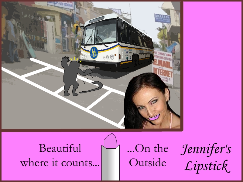


When I designed the first rough draft image, I wanted to subtly unearth the underlying message of cosmetic advertising that basically says “physical beauty matters” more than other things in life. In this case, one of the “other things in life” that beauty is portrayed as taking priority over (for the woman in the picture, that is) is helping another person who is in distress. The woman in the picture is so concerned about the way she looks—particularly, the way her lipstick looks—that she fails to recognize a nearby civilian in distress. I emphasize this underlying theme through the company motto which states: “Beautiful where it counts…on the outside.”
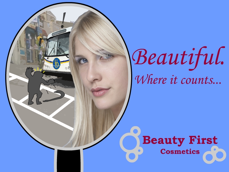
I wanted to get the message across that one’s physical beauty should never cause one to forsake the interest of others, but—as the assignment requires—I wanted to do it cleverly. Thus, using the critique of my peers, I decided to change the original image to be embodied in a mirror. That way, it would be obvious that the woman in the forefront is indeed self-absorbed. I also changed the company name to “Beauty First.” Yet, so as to make the message I was portraying remain subtle, I took out the “…On the outside.” I felt like it made the message a little too obvious, especially with the new additions.
Some have brought up the fact that I depict the distressed person as a silhouette. Indeed, I will admit that if I could have found an image of a person in the posture of the silhouetted figure that I drew, I would have used that instead. However, after drawing the silhouetted figure, I saw that it actually fit the picture for two reasons:
1. It matched the “!” that’s above the bus. The “!” is important because it clearly communicates that the person dropping the cane is in distress.
2. I noticed that the silhouette serves to distinct the distressed person as a background component, and it separates the person enough from the woman in the foreground.
I’ve also made further interpretations about the silhouette since the time I created it. One in particular is that the silhouette serves to “frame” the entire situation as a particular moment in time—or rather, a “choice” that the self-absorbed woman made at this particular moment. I think the lines over the silhouette head lend to this effect as well. A similar effect is when something drastic happens in a comic book (or even a movie) and the scene “slows down to a halt” and everything turns grayscale.
Below, I have a link to the original write-up that I turned it. I just felt it was necessary to better explain some of the intricacies that are going on in my picture. Hopefully, this has helped!
Original "Turned in" Write-up