Assignment #2
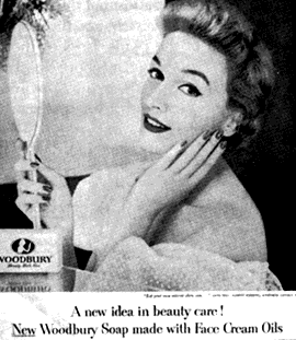
Cosmetic advertising has always interested me. The insinuation behind every cosmetic advertisement that says “beauty is important” is of particular interest to me. Common beauty advertisements such as the one below were the general inspiration for my own “subversive advertisement:”

At first glance, this advertisement seems pretty harmless. However, while it is indeed not as forceful as some current cosmetic advertisement, it still inherently promotes the significance of beauty as something to be of personal primary concern. Notice how there is nothing in the picture other than a woman and her mirror. It seems very self-concerned and perhaps bordering on self-absorbed. Indeed, I don’t think there is anything inherently wrong with beauty—of course not. But what does concern me is when beauty becomes the primary focus of one’s life. Indeed, that is exactly what I expose in my subversive advertisement. I show that the pictured model’s concern for her physical attractiveness was so great that she didn’t even notice (or care) when a nearby civilian was in danger. Is that okay? Of course, the sheer fact that I am “exposing this” in my advertisement implies that it is NOT. Rather, the implied counterargument in my argument is that perhaps being beautiful “on the inside” is where it counts.
Another advertising strategy I used was that of verbal simplicity. Notice that my advertisement has a mere 4 words in it (other than the brand name, of course), but the message is still communicated successfully. I think this is an effective strategy because it doesn’t bore the onlooker with extraneous information that is unimportant to the advertisement. The following Papa John’s advertisement represents the simple verbal strategy I was aiming for:

Notice that it is only 4 words as well, yet it remains effective.
Lastly, a design strategy I noticed after I implemented it was one of verbal sarcasm. For instance, the brand name is “Beauty First.” Yet notice how this statement contrasts with the oft-quoted “Safety First” statement:

The contrast between these two statements is seen on the two halves of the mirror of my advertisement. For instance, the model in the picture puts “beauty first” in her life, but she fails to care for the safety of others. It’s a sort of subtle sarcastic play on words, but I believe it serves to add another layer of communication to my subversive advertisement.
In conclusion, I feel that all of the aforementioned strategies are effective in communicating the message that beauty on the outside is perhaps not as important as beauty on the inside.